Spaces of Time: Julia Gaisbacher photographs Hanne Darboven’s World
I’ll admit: when I first picked up Julia Gaisbacher’s Hanne Darboven. Am Burgberg, I wasn’t sure what I was walking into. This might be another “artist house as museum” photobook, polished and nostalgic? Or would it actually let me feel something of Darboven’s presence? And maybe the bigger question: Can photographs really do justice to a place that was as much a mental universe as a physical one?
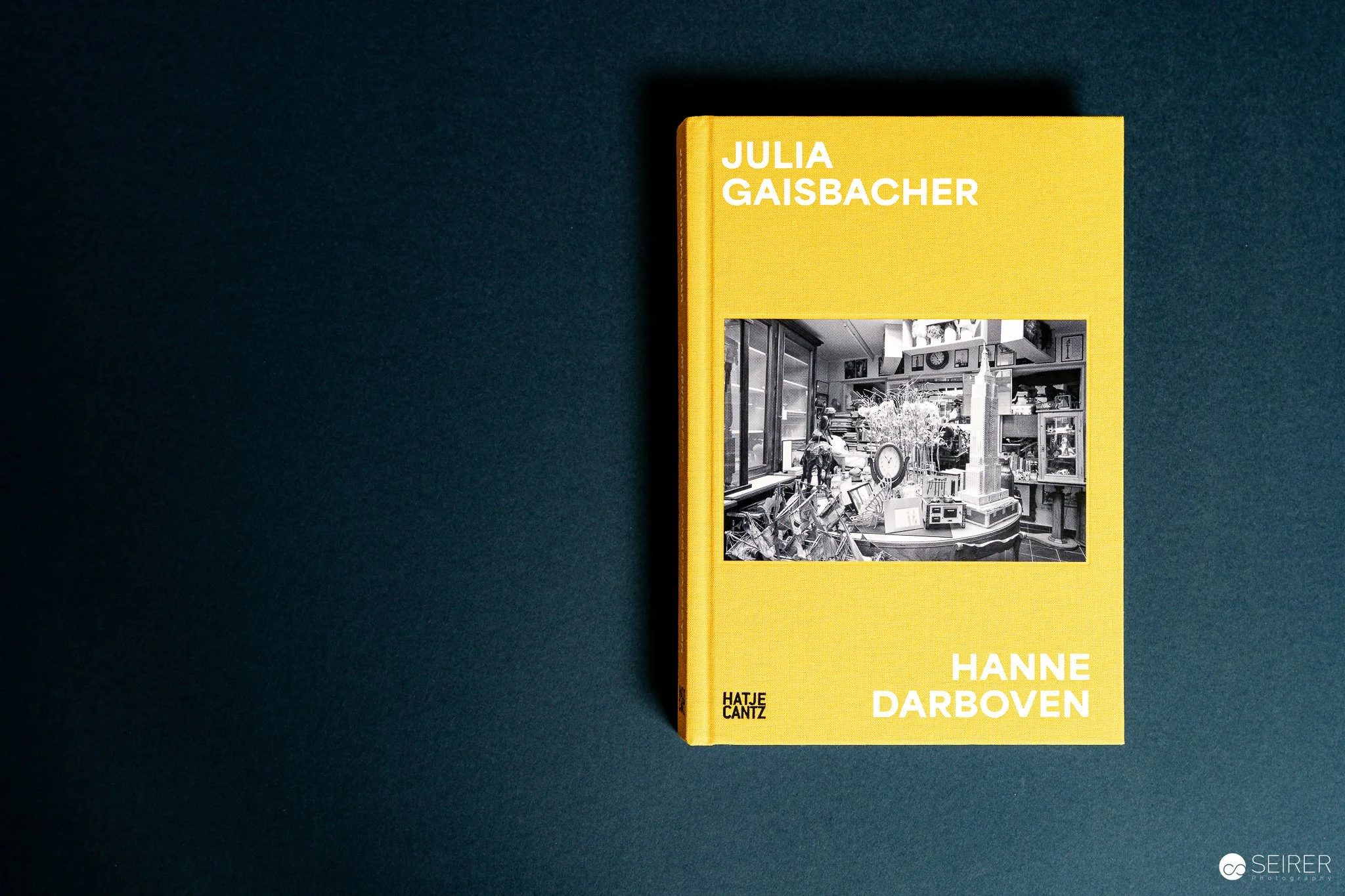
Julia Gaisbacher, Hanne Darboven, 2025, Hatje Cantz
The Book and Its World
The book is substantial, bilingual (German/English), published by Hatje Cantz and carefully edited. Essays by Dietmar Rübel and Petra Lange-Berndt frame the work, but it’s Gaisbacher’s images that carry the weight.
She takes us inside Darboven’s five houses in Hamburg-Harburg, a complex that was developed by her and functioned simultaneously as home, studio, and archive. What we see is the opposite of a white-cube version of Darboven, but lived-in rooms: cluttered tables, piles of papers, clocks leaning into books, objects edging into one another’s territory. All rooms are fully decorated with objects of relevance showcasing a huge amount of images and photos: even doors and ceilings are covered with photos.
The photographs are in black-and-white—an important choice. Color might have anchored these rooms too much in a particular “1970s-80s domestic” aesthetic. Stripped of that, what remains is form, density, rhythm. You start to read the space the way Darboven wanted us to read time: not linearly, but in layers, repetitions, overlaps. Take a close look at the photos of her desks and what she arranged on top of them…


Reading the Photographs
From a photographer’s point of view, what struck me first is the discipline of Gaisbacher’s framing. She doesn’t intrude, doesn’t dramatize with angles or light tricks. Her compositions are steady, letting the environment speak for itself. That restraint is hard to pull off—it requires a kind of quiet confidence in the subject.
The tonal range in her black-and-whites is beautifully balanced. Shadows never collapse into murk, highlights don’t scream. Instead, the grey mid-tones do the work, holding together the textures: paper, glass, wood, dust. It’s a palette that mirrors Darboven’s own obsession with repetition and system—variations within limits. The book cover features a bright orange/yellow which makes it stand out on a photobook-lovers bookshelf. It was specifically produced in a small format of 168mm x 242mm which creates a quite intimate feeling when looking at the photographs. Sizes does not matter all the time! Especially interesting was the layout of the book which presented the (in my opinion) strongest photos not as a spread over two pages to maximize the size but show them small, in the right lower corner - this way, their power was even enhanced! Also, there are no page numbers - there is no reason to have them.
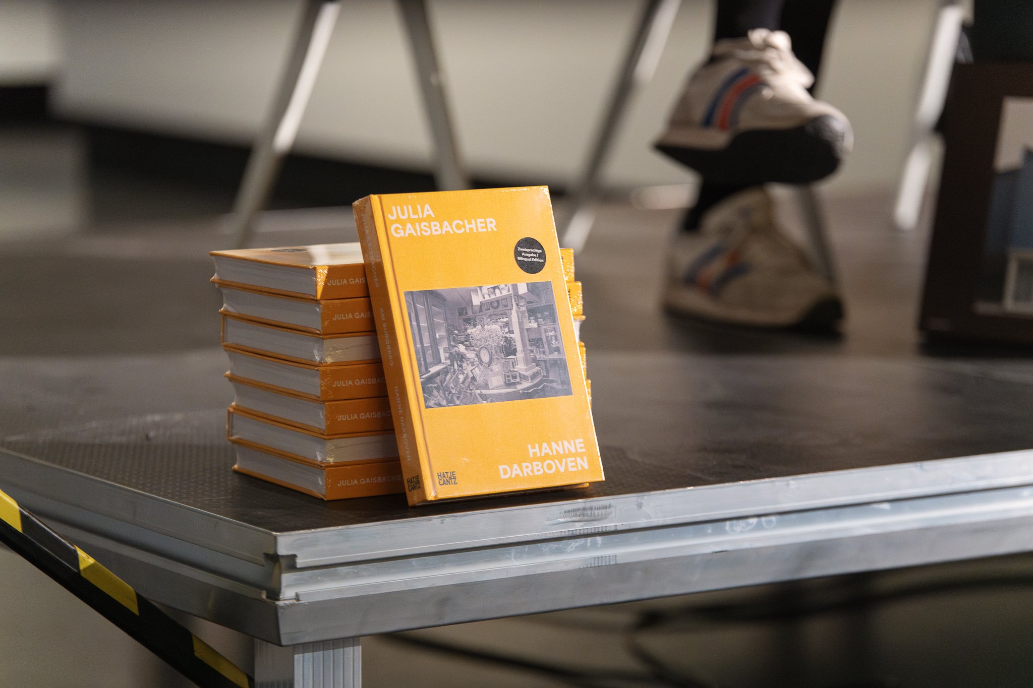
Julia Gaisbacher presenting her book at FOTO ARSENAL WIEN with Felix Hoffmann. May 2025
The texts, meanwhile, give useful anchoring. Rübel places the project in context, and Lange-Berndt brings in a cultural/material analysis. Honestly, I didn’t linger too long on them at first—my eye kept pulling back to the images—but when I did, I found they framed the photographs without smothering them. That’s not always the case in art books, and it’s refreshing here.
Even though the book has only just come out, it’s already getting traction online. Hatje Cantz has been pushing it prominently in their spring list, and retailers from Waterstones to Barnes & Noble have it stocked. Collectors jumped quickly at a special edition with signed prints via And The Editions—it sold out fast, which says a lot about demand.
Institutional support has been strong, too: the Hanne Darboven Stiftung is hosting a book presentation and talk at Hamburg’s Warburg-Haus, complete with a film screening. On Instagram, both Hatje Cantz and Foto Arsenal Wien have been spotlighting Gaisbacher’s images in reels, giving the project visibility beyond the usual photobook crowd.
It feels like this isn’t just another publication—it’s positioning itself as a reference point for how we think about Darboven’s legacy in space, not just on paper.


For me, “Hanne Darboven. Am Burgberg” is an invitation to step inside an artist’s archive. Gaisbacher doesn’t romanticize, she doesn’t sanitize—she observes, patiently, letting us make our own connections, browsing images back and forth as you start to recognize corners of rooms and arrangements.
If you’re into conceptual art, sure, you’ll want this. But even if you’re not, the book has something rare: it shows how photography can reveal and encapsulate the texture of a mind through the texture of a place. That’s what kept me turning the pages long after I thought I was “done.”
In May 2025, Julia gave an insightful talk about her work and new book at FOTO ARSENAL WIEN.
Julia Gaisbacher: Hanne Darboven. Am Burgberg
Hatje Cantz, 2025 | 240 pp. | bilingual DE/EN | ISBN 978-3-7757-5922-9

Julia Gaisbacher talking to Felix Hoffmann, Artistic Director of FOTO ARSENAL WIEN, May 2025
Other blogposts that might be interesting:


Related photo galleries: